Artist website
Unit 15 : Advertising production
Task one : advertising
-
What are the advantages of advertising in the selected sectors
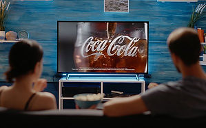
An advantage of advertising in tv is that you can see it visual and hear it as well and most people watch tv nowadays so a lot of people will see your advert
An advantage of putting your advert in the cinema is that it will be played on a big screen and it will be loud for a lot of people to see and hear and most people will see it because it plays before the movie starts
an advantage advertising on a radio is that most people like to listen to a radio while they are driving and they don't have an option to skip the advert so they will have to listen to the advert.
An advantage of a print advert is that you will see it on the item you buy for example if you buy a drink with a print advert on it it will be clear to see.
An advantage of a web based advert is that they will pop up on your screen and it will be clear and big so that you can see the advert.
TV advert
Cinema advert

Radio advert
print advert
web based advert


2. What are the disadvantages of advertising in the selected sectors
one disadvantage about advertising on tv is that not everyone will stay to watch the advert some might tv of their tv go on their phone while the advert is playing.
A disadvantage about advertising in the cinema is that a lot of people know about the adverts at the start so they might come late to avoid the advert and not everyone comes on time for the movie
A disadvantage about advertising on the radio is that not everyone uses a radio and most people will connect to the bluetooth in their car and play their own music
A disadvantage about advertising on a print is that not everyone cares about what they see on a print and it is easy to take of the advert print
A disadvantage of advertising on the web is that most people will avoid the advert because of all the different type of virus out nowadays so they won't click on it for their safety
3. What are some of the challenges that face advertisers when distributing on different platforms
Some of the challenges you could face by putting your advert on TV is there might but other competitors selling a product like yours so you will have competition while trying to sell your product
Another challenge is that it is really expensive and not every company has enough money to pay for it
A challenge you might face trying to advertise your product in the cinema is that not everyone comes on time for the cinema so it wont be full so you cant advertise it to a full audience
A challenge you might face trying to advertise your product on a radio is that not that many people own a radio nowadays and the radio on the car most people don't use much either because of bluetooth
A challenge you might face trying to advertise you product on a print is that it will be hard for it to reach the right audience for example you could be advertising something for men but there is also a high chance that females will see it more than males
A challenge you might face trying to advertise your product on the web is that not everyone will trust the link because of how easy it is to get virus nowadays so for their own safety they might avoid it.
4. What does the increase in digital consumption mean for traditional media forms such as print media
The increase in digital consumption means that traditional media forms like news papers and magazines will go out of business soon because these type of print magazines all have a digital form which you can access easily like phones computers and tablets because the growth of technology doesn't seem like it is going to slow down
on the website onhike it says the internet has decreased the need for traditional media because it enabled consumers to join social societies within their neighbourhoods across their countries and internationally it has empowered them to converse at their leisure 24/7 with friends
Task two : target audience
mass audience
Mass audience refers to media technologies used to disseminate information to a wide audience. The key function of mass media is to communicate various messages through television, movies, advertising, radio, the internet, magazines, and newspapers
Examples
-
radio listeners
-
televison viewers
-
magazine readers
-
website viewing
Niche audience
A niche audience is a more focused subgroup of the broader markets target audience. The niche audience has a specific group of needs which can be met by a target product or service.
Example
For example within the market for men shoes are many different segments or niches. Shoes for vegan men would be a niche market as would shoes for plus sized men or shoes for doctors
Psychographic
Psychographics is the study of consumers based o their activities, interests and opinions it goes beyond classifying people based on general demographic data such as age gender or race psychographics seeks to understand the cognitive factors that drive consumer behaviours
examples
The most popular psychographics are personality traits, lifecycle stages, interests, attitudes or beliefs and activities. Marketers could also differentiate between groups of consumers based on their buying priorities social class and more
Geodemographics
Geodemographics are consumer segmentation models created by aggregating demographic attributes within a specific geographic area. Variables related to age gender education level income and more reveal lifestyle segments that can be applied to marketing retail planning and site selection analyses
Examples
-
marketing strategy
-
motivation
-
quality control
-
customer
-
capacity management
-
work life balance
demographics
Media producers define and categorise their audience through demographic profiles a demographic audience profile defines groups based on things like age gender income education and occupation.
Examples
Demographic information examples includes age, race, ethnicity, gender, marital status, income, education and employment. You can easily and effectively collect these types of information with survey questions

2. Which characteristics are commonly used to categorise audiences
Age, income level, job type, and geographic location are all demographics you can use to sort your audience. This method is popular for a reason it works one type of location based segmentation strategy is to approach customers during the time of year they're most likely to need your product.

3. What are the different categories of audiences according to young and Rubicam's theory
The different categories of audience according to young and rubicam's theory are
-
The mainstream
-
The aspirer
-
The explorer
-
The reformer
-
The struggler
-
The resigned
-
The succeeder

4. Why is young and Rubicam's theory referred to as being cross-cultural
There reason young and rubicam's theory is referred to as being cross-cultural is because it is based on stereotypes and also relecting their own needs the theory is named 4c's the 4c's is really useful to categorise audiences it is better than comparing something to the traditional demographic categorisation method which dose depend on the job you work and the class you are in weather that is low, middle or upper
5. Explain what products might have been advertised to each category of young and rubicam's theory
The explorer- When something new comes out they want to get it first and see what it is like they are looking for discovery
The aspirer- They are the wannabes they do stuff to make them look popular and like to buy rich stuff that are popular these are brands like gucci, louis vuttion and more like prada they are looking for attention
The reformer- Medating taking time out people that would care about what is happening in the world more likely to watch discovery channels more likely to drive electric cars they are looking for
The mainstreamer- Like to try popular brands because they are popular and they like mainstream media products they like to keep up with the media
The succeeder- someone that likes to win and succeed might be someone winning awards they like to win and succeed
The resigned- newspapers older shows from the past even car shows they like to enjoy the rest of their lives in piece
The struggler - they watch stuff like Jermey Kyle and they would like to try there luck in the lottery they are struggling in life with money
Task three : media kits (magazine)
VOGUE

From this page of vogue i could tell the target audience age already which are adults mainly from age 31 and older they do have some younger audiences but most of them are grown adults and the page it says that the average age of the user is 44 which is an adult.
Since they have a large audience from different social media platforms gives more reason for them to make more digital since most of their popularity comes from online on social media platforms.
This can also mean that younger views can looking at vogue as well because it is common for young people to use social media a lot so they will also reach the young people that are interested in fashion
But vogue is getting more attention from adults than teenagers online this could mean the people modeling on vogue are meant to get the attention of the older views online.

This page on vogue shows clearly that they don't have a certain type of ethnicity that they aim for and they aim for all types that means black white asia and more.
You can see from the different images there that they aim for any ethnicity this helps to reach many target audiences and help them grow from place to place reaching other countries expanding their target audience not only do they talk about ethnicity here they also talk about the age the first one talks about how the model was 64 years old this helps reach even bigger target audience for age.
they also mention how rihana was one of the First woman of colour on a September issue in British Vogue’s this shows how they are trying to reach other audience that are from different ethnicity because they included a person of colour to help bring more attention to their magazine
They also talk about religion and how they don't discriminate depending on your religion in one of the text it says Halima Aden becomes the first hijab-wearing model to star on the cover of any Vogue globally, receiving worldwide press this goes to show that when they do not discriminate they get attention from it help boost their views giving them good attention
This page in vogue shows that ethnicity in vogue is not something they aim for and they don't have a specific ethnicity they would aim for

On this page of vogue it shows you the different type of magazines they produce not only fashion magazine but also food and drink art and culture and more this helps reach different target audiences this helps bring in more fans towards vogue
This is good because people might really like vogue but not fashion so when vogue produce different type of magazines for different audiences it gives them more attention
The fact that vogue produce different types of magazines for different target audience for example food and drinks which is something that would be aimed for adult females this is just one of the target audiences that vogue aim for but there are also many more target audience they aim for
Vogue don't have a specific target audience they seem to aim for adults but adults of all king and you could also say teenagers as well they have a wide range of magazines that can be aimed for any target audience

On this page of vogue you can see the type of companys that would be on a magazine like vogue. The companys shown here are little brands they are big brands there are many other brands that can be on vogue it is mainly really higher class brands it can also be designer brands like louis vuttion, moncler and many more you wouldn't see brands like KFC on a vogue magazine all the brands shown are very popular and really successful brands that can bring vogue and themselves a lot of money
The only type of brands that i would work with vogue are designer companys and the companys on the page this is because vogue these are very popular brands that are of high class and it will put good attention on vogue and make it look better it will also make them a lot of money from these brands since they are really popular and expensive so these brands will pay a lot to advertise their product on vogue bringing them good publicity as well
Why i think a brand like KFC won't be on a magazine by vogue is because of its class KFC isn't a high class place so it wouldn't make sense for it to be on vogue and it won't bring that much attention to the magazine and it just won't fit in will compared to the other stuff on vogue
Empire

In this page of the empire magazine it gives us information about the average age for the people that read their magazine it says that their average reader is from age 18-40 i would agree with this because most young adults really enjoy stuff that involve super heros but i feel like it could also be younger people that read these magazines mainly teenagers aged 13-40 because it is mostly teenagers that enjoy stuff about superheroes
LAA: Core assessment

Print advert
In this print advert it is advertising food from burger king. In this print advert they are using the male gaze theory to get the attention of males you can tell by the way they use mise-en scene and the NVC of the female she has a very sexual facial expression with her mouth wide open the prop which is the burger the way it is positioned in front of the female and because it is in front of her mouth also represents something sexual again using the male gaze theory but with the prop this time. the lighting in this advert is a mix of low-key and high-key lighting they put more low-key lighting on the female this could be because they wanted to bring more attention towards the female and her sexual facial expression this also supports the male gaze theory why i feel like there is more low-key lighting on the burger is because they want to bring more attention to the female because of the male gaze theory even tho it is a advert about food they feel like if they take advantage of the male gaze theory it will bring them more attention
You can see that they used a wide angle in this shot this is so that they can fit in everything all at once in the advert giving it the full effect and so that it doesn't look like it is missing pieces.
The text in the advert are used for the male gaze theory the text says it'll blow which is again something sexual and the fact that the text is big and bold shows that they really want that text to stand out to the audience mainly males because of the male gaze theory
This technique of the male gaze theory that they are using can really help them get the male target audience and bring in more customers and raise their profit but it also has bad things to it like for example some females wouldn't be happy about the way they are portraying females in that advert and think that it is rude and disrespectful also giving burger king bad attention.
The main technique for this advert was the male gaze which you can say works well or doesn't depending on how you view the male gaze
In this advert you cant see the outfit of the person but just the head this is so that the outfit wont get any attention and bring the audiences attention away from the female and the burger
I feel like this advert will fit in with the strugglers because burger king isn't a really high class place that is aimed to feed people that are rich but also people that might be struggling or people that aren't considered rich or in an upper class rank
How the Donald gunn theory was used in this advert was they used unique personality property how they used it in this advert was the way they positioned the female and the sandwich making it unique to other adverts so that it will stand out more than other adverts promoting the same thing. This technique highlights something indigenous to the product that will make it stand out.
Another technique that was used was associated user imagery in the advert it looks like it is targeted for hetrosexual people because of the sexual message the advert sends out
Broadcast
In this advert they use stereotypes to reach the audience .At the start of the advert they start of showing a teenage black boy that talks about running to training and the lauguage he uses isnt formal language which is a comain stereotype that most teens don't use formal language they use this stereotype to try make it more realatabe to the target audience which is people in london from age 14-30 i know this because the ad itself is based in london and it is called Londoner.
It tells you that the advert is in London when they talk about Peckham in the advert a girl talks about running through Peckham at night it is a comman stereotype that Peckham is a scary place and they show this stereotype in the ad when she is running through Peckham she is being chased by skeltons on bikes and one of them try to grab her these skeltons are there to represent how scary Peckham is because skeltons are used to scare people so the use of the skelton in that scene was to support the stereotype that Peckham is a scary place
But in the advert they also use counter stereotypes when they show a female playing football and she is playing very well it is a common stereotype that females cant play sport so when they show a female playing football very well it counters the stereotype this also helps bring in the support of the female audience that like football giving the advert good attention
Another stereotype they show in the advert is that no one in the uk plays ice hocker and that it is an unpopular sport they show this when the boy goes to play ice hockey by himself showing that no one plays the sport this is a stereotype because people do play the sport it might not be a popular as the other sports but that doesn't mean no one plays it in. In the advert it shows him playing ice hockey by himself trying to really get the point across to the audience that no one plays the sport
They use all parts of mise-en scene in the advert an example is the location. The area they where filming in was London this is easy to tell because the advert is called Londoner so it will be based in London they also mention a place in London call Peckham which is a well know place in London. The reason they picked London for the area to film is because it will match the title name and the people in the video match the type of people in London.
For lighting in the video they use a mix of low-key and high-key lighting and these lightings are all natural lighting some of the shouts are in high-key lighting which can be used to show the time of day this is the same for when they use low-key lighting. They use low-key lighting in some scenes because of the type of sport they are playing for an example in caged football is a very popular sport in the night and swimming is a sport that is meant to be done in the day when it is bright.
They use a lot of props in this advert considering there is a lot of sport it makes sense for them to use props like footballs, basketballs, hockey sticks and many more props these props help us to understand the sport that they are playing and it gives us a view on how they play the sport if they didn't have the prop for the sport they where playing or if they had the wrong prop it wouldn't make sense so props in this advert where really important.
The costume that they are wearing all depends on the sport they are playing or what they are doing in the video in one of the clips it shows a kid running to school in a uniform this helps the audience to know that he is a school kid also shows that he is in secondary school because secondary school students wear school uniform.
Another example of the costumes used is the girl playing football she is in a full football kit this can help to show that it is professional football because of the location as well she is in a stadium
I feel like this advert belongs in the mainstream section because Nike is a popular brand and mainstreamers like to try popular things this also helps them to be able to mainstream the products also inform other people about them that haven't seen the advert already
This type of advert would be aimed at mass audience because this is something that they can listen to but mainly watch so this would fit in this target audience giving them good attention for the advert and getting new viewers also because Tv watchers are on that list of mass audiences and this is the type of ad that you can see on tv or maybe you can here about on the radio a shorter version that would make sense to the listeners.
How the Donald Gunn theory was used in this advert was the used the ongoing characters and celebrities to help promote their advert. In this advert you can see many different celebrities and they are all there to help promote the advert this helps gets the attention from their fans to go and watch the advert to see what their favorite celebrities are doing on the ad bringing them a lot of attention. In these adverts they use people that are already associated with them for example Mo Farah has a contract with nike so he has been on many different nike adverts so that makes him a recurring celebrity in the nike adverts. This can help cement the brand's (nike) identity into the audiences brain.

In this web based advert the main thing that they done really well was the use of the colour they matched it with the shoes they made the background a dark orange and the bubbles around the text as well and some of the text in orange this helps put and a good design in advert helping draw attention towards the advert.
The positioning of everything in the advert is placed really well giving space so the shoe can be shown well for the audience to see and the extra info on the side of the advert is placed really well in a position that is clear for the audience. The type of font they used for the texts where picked really well the main stuff that they wanted to see where all in bold and it was positioned at the top of the page making that the main thing they want to see other than the shoes. They also positioned the place of the phone number really well i say this because it is important but there are some other stuff in the advert that they want the audience to see first for example the shoes is the main thing but still providing their number also helps them and also really helps the audience when in need for help about information about the shoes. The part were it talks about 50% off was designed really well making it look like something is peeling of but the design on the 50% is also made really well making it orange to match with the background and the shoes is a nice design also getting attention from the audience.
The word choices in the advert are basic and stuff you will normally see but the words that are on the advert are all important information about the shoe like links to buy the shoe find out more about it and also a phone number for any more questions regarding the shoe.
This advert is clearly aimed for men and not females the main thing that gives this away is at the top of the post in bold when it says men's shoes stating clearly that they are for men but females could also buy this for a man because now they can see very clearly that it is for men and might give it as gift for them
The age for this advert isn't really clear in this advert but it will probably aimed for young teenagers and up and i cant really see these type of shoes for kids that are young or under the age of 13
These shoes are built for any male and doesn't specify anything about have to be form a certain ethnicity to be able to wear them if it did it might cause people getting mad about how they are discriminating and lead to bad attention which wold be really bad for the company
I think this might fit in with the explores because it is something different from other design shoes and something they can try get first to see if they can enjoy and inform other people about it
You could say that this advert fits in with niche audience this is because it clearly stats that these shoes are for men putting the text in bold and in a big font also the positioning of the where they put it at the top of the page just shows that they want the audience to clearly see what target audience it is meant for.
How the Donald Gunn theory was used in this advert was they used the unique personality i say this because of the use of color way in the advert you don't see a lot of adverts us orange in their ads this is something different and it also helps it stand out more.
Task 6 : fashion advertising

Conventions and categories
This is the cover of a vogue magazine they are advertising clothes so that makes this magazine a fashion magazine the main product that they are advertising in this cover is the outfit of the model that is why everything is positioned the way it is so that the outfit is clear to see all the text are pushed to the side make the outfit that they are putting on display visible for the audience.
The main thing apart from the outfit in this magazine cover is the text mainly the vogue text since it is the biggest and boldest showing that they want it to stand out so people know that it is vogue which is a popular magazine brand. Another they want to stand out is the style remix fashion goes pop this is because it is also big and bold but it is in pink which could show that they want it to stand out more even more than the vogue text i say this because the vogue text is behind the model were as this one is positioned in front of the model they also might want the retro special to stand out because it is a different colour why colour matters in this magazine cover is because you can see the type of colour pattern they are going for black grey and white so when something isn't in one of those colours it makes it stand out more
Mise-en-scene and camera techniques
The costume of the model is like a dress but the main thing that you are meant to take from the costume is the colour and jewels on it that is some of the main things you can see on the costume but you can also notice how it kind of matches with the background trying to keep cohesion going in the cover.
You cant really see match of the setting and where it is but you can see they used colours for the background and some of the colours are there to match the costume of the model
The NVC of the model is really good and you can see what they are doing for the face of the model shows us that she is confident in her looks and proud so does the way she sits like a royal person also giving of confidence all together from her facial and body expression you can see how confident she is
The lighting in the cover looks like it is high-key lighting and it is hitting her you cant really see much of the lighting but you can see that high-key lighting is being used this could be because they want it to be bright and stand out.
There aren't really much props in the cover you could count her bracelets and those could also be used to show wealth or royalty

They used a medium close up to capture this shot of her this could be because they want to show of the outfit mainly and don't have a match for the whole outfit yet so they did this so that the main focus can be on the dress. They also didn't want anything to close for example a close because it is a fashion magazine so they need to show her outfit otherwise it wouldn't make it a fashion magazine so they needed a shot to show of her outfit

subject representation and stock situations
This is a vogue fashion magazine cover in 2020 there is a clear meaning behind this cover in 2020 covid-19 was at it's peak and everyone was in lockdown one of the main things you can take in from this cover is the text where it says freedom on hold which suggest that are freedom was on hold because we where all in lockdown the main image could suggest that it is stopping lovers from seeing each other because they are kissing with a mask on also to support this it also says covid-19 fear will not stop us meaning that covid can't stop peoples love or freedom. This cover has a lot of meanings it is just how you view it.
For this magazine cover i don't feel like they are aiming for any type of specific audience this is because everyone was going through the same thing in 2020 everyone was in lockdown throughout the whole world so i feel like this magazine cover is aimed for everyone and it is something that everyone can relate to because we all went through the same thing in 2020 no one had it differently.
But on the other hand it could be more related to older people maybe age 15 plus this is because everyone tho covid was holding everyones freedom it was effecting everyone differently some harder than others i said 15 plus because some people had their most important exams they had to do but covid ruined that for them and some people had really important jobs that they had to go to but couldn't work because of covid.
Some people might feel like this cover is aimed at heterosexuals because in the cover is a male and female so some might feel as tho it is aimed for heterosexuals because they. used two straight people but i feel like that isn't the point that they are trying to get across and there is a deeper meaning to this cover
Task 7 : source audience information

This question help me to understand how many people to put in my advert so that it can fit my target audience and so that it will look right to them
Most adverts have more than one person but some also have just one person i wanted to get the right amount of people that my target audience would have wanted to see
So this question was asked to see how my target audience would feel about how many people where in the advert

This question helped me understand where my target audience see adverts the most so i know where to put my advert so it will be shown to people that are interested in my product because if it was shown on a print advert it might not reach people that are not interested in my product
This question was important because making sure you advertise your product in the right area is really important so that it can sell well
Web based was the most picked answer this is probably because everything is more popular on the internet nowadays and it gets more attention from audiences some did say broadcast this would be because it is still another popular way of promoting your product

This question helped me know the popular questions to use for my product for not just my fan base but for other people that are interested in the product if you
If i picked a colour that isn't popular a lot of people wouldn't like it and wouldn't take interest in the product
Black is a nice common colour that most people like to wear and something that can sell really well
Doing something your target audience likes really helps for it to sell easier also shows that you like to listen to your target audience showing that you are a good company that listens to their audience to improve their product.

This question helped me to understand what type of mask my target audience like to use also telling me which one is more popular and would be easier to sell not only to my target audience but to other people that wear masks
If i made a disposable mask not as much people would buy it compared to a reusable mask


These questions helped me understand who the people where that where filling out my survey and if the fit into the target audience so that i could get the correct amount of feedback about my product i am going to make
It is also important because if someone that wasn't in my target audience did this it could lead to a mislead of me creating the product for a different and it might not do as well as the other target audience

This question was important because there are many different camera techniques that are used on all magazines so i wanted to make sure that i got the right one and so i could understand which one my target audience would like the most and which one i could use to try to create a meaning for them to understand
This is also important because we want the photo for the magazine to come out right because it is important because that is how we will advertise the product so the photo has to look good for the audience

I asked this question because i wanted to find out how popular face masks are with my target audience so that i can know if they will like the product i am selling
Task 8 : source interactive material

I picked this image because i like the design of the mask also the camera shot they used to clearly capture the image the main thing i like tho is how the model isn't looking at the camera and is looking away gives a sense of mystery
The thing i really like about this magazine cover is that it has a clear mean to it a meaning that everyone can see and understand clearly the reason i picked this as an image that will inspire me is because i want me magazine cover to hold a meaning as well and this magazine cover is the perfect example of having a meaning it also clearly shows the face mask because of the camera technique they used


The reason i picked this magazine cover inspired me is because you can see the face mask clearly not only that but the NVC of the model her body language shows how confident she is in herself i also like how they darkened the image giving it a nice edit effect making it different from other magazine covers that use a lot of bright colours just a simple black and white cover can stand out and create a lot of meanings for example white can be a sign of purity and black can be seen as power both these colours have many different meanings it is jut how you see it
The reason this magazine cover inspired me is the use of cohesion in the cover i like how all the colours match from her outfit to the background making everything look good and the colour they picked looks really good and professional also the NVC of the model the way she stands and her pose just shows that she is confident in herself


Why this image inspired me is because of the costume it is a good costume which stands out it is something different compared to the other masks you will see in magazine covers


I picked these five images because they will be kind of similar to my style how they will is that in all these five magazine covers i have picked they all have one thing in common and that is that they are not looking at the camera they are all looking away from the camera i feel like this can make your magazine cover look better and different from other magazine covers most of them they will look at the camera so i wanted to do something different.
Also as you can see in some of them their text is in a different colour which is something i plan on doing for my cover i want some of the texts to be in a different colour so that it can stand out i also want the logo to stand out as well in a different colour like some of the cover images here
I also like the positioning of the headline in these magazine covers it is where it normally is at the top of the page
But i also like the font styles that they pick mainly the apple watch magazine cover i like how tall the font is and how it isn't wide or bold but it can still stand out because of the position of the text.


These are the five photos that i picked that could make it into the magazine cover in most of these photos one thing you can realise is that most of the time the subject isn't looking at the camera and i got this from the other magazine covers i looked at which are shown above my pictures i also took some more pictures but these are the main five that i would pick for my magazine
slogan font
inkunt antiqua, lobster, pacifica condensed, raleway semi bold, oswald medium
Logo font
IMPACT, Stencil, Museo, Chelsea market, Bodni poster
I have picked these fonts because for some of them i would like to keep cohesion going from the logo to the slogan but i also want to make it look different so that it isn't boring to the audience and makes it look better with different designs on the cover
Most of the fonts here are in bold i picked a lot of bold fonts because i want the logo to stand out to the audience so that it is noticeable from a far
copyright
I picked certain type of images so that i don't have any copyright issues

I like the way they used the colour in this magazine cover how all the text aren't all in black but they have different colours this helps it to stand out because they used bright colours that help stand out mainly the yellow really makes it stand out a lot and i like the positioning of the text how it is all around the main image even tho this is how most magazine covers layout their texts they made it look better because of the colour scheme picked
I also like how they didn't use the same font and change it up on different text this also helps it give more design to cover and make it look different from other covers that just use the same font
The wording on this magazine cover shows that this cover was made for the summer they have whats hot for spring written more than once on the cover clearing stating what season this magazine cover is for
The key image in this magazine is a image of a celeb this is really helpful to bring attention to the magazine when they realise that it is a famous person they might take interest in the magazine
In this magazine cover they make it all about the image and not about the text you can tell this because there isn't a lot of text like other magazines where there are texts on both sides of the cover all around the main image but there is just a title and a few text on the side.
This can also help the text stand out how is because since there isn't that many text it will stand out because there isn't any text or a lot of text.
Since the main thing is the main image in this cover they had to make sure the main image was a good image so that it can stand out and get good attention from the audience.
The NVC for the model is matching with the costume he is wearing he is standing in a very posh and confident way you can tell that just from his body position also his facial expression he has a very serious face on and all of this matches with his costume he is wearing a sute which can connotate he is rich or that he is in a very important line of business all of this matches his facial expression his body expression and his costume all match to create a meaning of seriousness.
They also used a long shot this is so that they can capture the whole outfit and make the meaning more clear because if it was a mid shot you wouldn't really be able to tell much about his body expression since you can't see his whole body. So the long shot helps express the meaning of the model even more.

LAB : Core assessment.
My idea on how i am going to advertise my product is by showing my product in popular and crowed place where a lot of people are so that my product can be recognised by many different people that includes people from my target audience and also people that aren't from my target audience


These are all the photos i took for my billboard i used different camera shots in most of them one thing that stayed the same is the mask. In my survey i asked what type of mask they used the most and people said that they used reusable mask more than disposable mask so in my photoshoot i made sure that my subject was wearing a reusable mask this is because if it was a disposable mask it wouldn't match what my target audience wanted making it look bad because it would seem like we don't have a specific target audience that we are aiming for and just doing whatever with out thinking. So using the right type of mask in the photoshoot was really important.
Another thing i took from my target audience was the colour choice this could have been one of the most import things in the photoshoot because colour is something that stands out to the audience when someone sees a billboard one of the main things that can stand out before seeing it is the colour on the billboard. In my survey they mainly all said that they like to dress in black showing that to get my target audience attention i would need my subject to be dressed in black so that it feels like it can relate to them. If i used a different colour that wasn't close to black for example red it wouldn't fit my target audience so it wouldn't do as well because i didn't stick to the main and first target audience so the purpose of my subject wearing black was so that my target audience would feel like this is aimed at them it it is something that they could take interest in because they also like to dress in black.
In most of the pictures i used a lot of medium shots this is because this is what my target audience thought would be best to advertise my product i also used medium shots because i was advertising a face mask so i wanted it to be clear to the audience so they can see the face mask i didn't want it to be to close because if it was to close the outfit wouldn't matter and the billboard wouldn't look as good because it would just be a close up of someones face wearing a mask but if i used a mid shot i could still create a meaning in the photo if i used a close up i wouldn't be able to get a meaning across in the image only in the text this is because he is wearing a face mask so it would be harder to create a meaning in a close up so i used a lot of mid shots.
I only used one person in my photoshoot because i am just advertising a face mask and it wouldn't matter how many people where there it also makes sense just to use one person as a face mask is used protect you from other people so having more than one person wouldn't make much sense. My target audience didn't really mind how many people where in the photoshoot i understand this because this isn't really something that can affect them in a big way
I also asked what type of advert they see the most and a lot of people said web-based adverts i asked this question to find out how popular print adverts are and how well they do
I also asked how often my target audience uses mask i asked this because i wanted to understand if my target audience would like the product i am selling and if they would buy it and from the survey it shows that they would buy it so when editing the advert i made sure that they can see the mask that is why i put that image of my subject wearing the mask the biggest and in the middle so that it can show clearly that it is a mask
digital work
This was my first idea for my billboard advert i put the slogan on the top of the page to do something different to other magazine covers so that it can stand out more also to make it stand out i will put them in bright colours so that they also stand out
I want the main image to take up all of the page so that it also stands out but i want it to stand out more than the slogan and logo
The reason i went for this layout is because i want all the focus of the audience to be in the middle that is why i put the slogan in the middle for this layout i want the logo and slogan to be in the same colour but i want the slogan to be in a small text and font so that it won't get in the way of the main image but i want the logo to be bigger than the slogan and in a bright colour so that it stands out i want one main image so that it stands out but i mainly want the logo to stand out more
I used a different layout for this one for this layout i wanted the main attention to be the main image and the logo how i am going to do this by making the main image different to other main images instead of have one main image i will put more than one different images in the space there and the logo will be in a big bright colour so it can stand out as well but the slogan will be in the same colour as the logo creating cohesion in my advert
For this layout i went for a simple one making the main image the main focus this is because i only have a few stuff on this billboard advert only the main image logo and slogan so it would be hard to make the billboard advert stand out if i was trying to use the slogan or main image it would be easier and better so the main image will take up the whole screen but i will also make the logo visabule and clear so putting it in bold and also in a bright color this will also be the same with the slogan

For this layout the main focus is the main image which will take up all of the page but i did something different i decided to write the slogan going down the page just to do something different compared to other magazines

The reason i made he layout like this is because i want to try something different from other billboard adverts that is why i put the logo and the slogan at the bottom together and the main image will be all over the page to make it stand out the logo will be big and the slogan will also be big but not bigger than the logo because we want the logo to stand out more

Regarding the location i used from my pictures i went to a place called the safehoue2 to take photos how this contributed to my final product is that it can give the image a sense of mystery like why is he there. Backgrounds are something important for images it is something that stands out sometimes even more than the person in the image if i went for a plain background it cold have made my cover look boring and also it wold give no meaning to the image the audience could even find it boring because it is just a plain background with nothing to it no meaning no sign of anything just a plain background there that creates no affect to the audience.
I said beore that i wanted to create a meaning in my magazine cover and a background is a really good way of creating a meaning for the audience it can even be better than the person in the image sometimes the background gives of mysterious because it doesn't look clean but old and scary so i wanted the audience wondering why he is there how he got there. The loction also matched withe the photos i took if it was any other type of bacground like a lake for example it wouldn't match with what i as going with and could completely ruinning my cover
I decided to use photo shop to help me finish my product the reason for this s because photo shop is something that isn't that hard to understand and use and your end product can come out really well for an app that isn't that hard to use. I alos feel like it will be able to get done quicker because of ho straight forward the tools are they explin clearly what each tool does so you won't have to go and search it up it alo has a side selectin of tools for people to pick from which can hep them in different ways.
Photo shop is alos one of the most popular ways for someone to edit a picture because of its popularity you know that it is a trusted app to use also a app that is well made and also quality
The advantages of using photo shop are it has many tools that i used in my advert for example the blending tool this tool helped me blend two different colors together for the background of my magazine this can help it stand out more because it is giving it a different style this is because most magazine covers backgrounds are just one color but mine is a mix of two colors. So one advantage is the tools that come with photo shop has many different ways in which you can design your photos.
Another advantage is when saving your work you won't have and problems or have to worry about your work going missing because the saving process in photo shop is designed well and made so that it is easy to use. When saving your work there is no chance of it getting lost i have used photo shop before and i have not had any problems losing my work
Photo is also easy to use and understand when using photo shop if there is a tool that you don't know what it does if you hover over the tool it not only explains what it does but it also but it also shows you a short video showing you how the tool works which is really great when you want to try new stuff out this helped me design my advert in many different ways until i was satisfied with what i got
Challenges i feel like i am likely to face at post production are making sure my final design is the one i want because most times after my i have finished my work i realize many different ways in which i could have improved my final design so to avoid that i am looking at many different styles in which i can design my final design so that i and my target audience feel like it is made to the best of its standers and can get peoples attention
How i would determine if my advert was a success is if i listen to what my target audience said and if i put it in my advert this is because i am trying to sell my product to a specific genre so if i met what they wanted i would feel like it was a success this is because i am selling my product to them so i need to understand how to get their attention and what i need to do to get their attention.
So if i listen to my target audience well enough i feel like my advert was a success
How i intend to make my advert stand out move than other people that are also advertising the same time as me is in my advert it is different from other adverts in one way which is that in most of the other adverts they will have one image of the person in the mask as the cover but in my advert i have more that one image of my model in a mask making it stand out more already compared to the other adverts another way is because of the text choice i am going to use i want to put a catchy slogan on my advert so that it can stick in peoples head and get the word spread around so that it will be more talked about than my competitors
For the billboard i picked to make it horizontal this is because i fell like it would fit my cover better this is because if it was vertical there is a chance that it would stretch out my cover i also picked horizontal because i feel like it would suite my cover better and also because i feel like it could get more attention from people on the streets and in cars
The changes i would make to my format if i was changing it to online would be making it more bright so then it can stand out more when it is online if i went to go change the billboard to vertical i would change some of the font size and maybe adjust the main image a bit as well
The billboards i would put my advert on are a place in central London this is because central London is a place where a lot of people are so it will be easy for your product to be seen from and also since it is a busy place face mask would be worn all around the place so it would be a place where someone would be able to notice my advert not just because of how busy the area is but because the same type of clothing that i am designing is being worn all around the area there
Another place i would like to see my advert being advertise is any busy shopping malls like stratford this is because if my product is advertised in a shopping mall or near a shopping mall this helps my product grow because of how busy the area is but also because there is a shopping mall near by so if i sell my product in the shopping mall near the billboard people will be able to recognise it and go buy the product near by as well giving my product attention and money at the same time


This is one thing that i change when editing my advert i made my canvas for my billboard advert wider this is because i want my billboard to be horizontal so i had to make it wider
The image on the left is the canvas i was working on early you can see that the width on the canvas before is way smaller than the image on the left this is something key that i needed to change for my final production for my billboard
How i did this was at the top of my mac i had to click image and after clicking that i saw a option saying canvas size this is where i found out how to make it longer for my advert


Another thing that edited is removing the background from the image i did this because theses are all different images and they don't all have the same background so i had to add my own background but first i had to remove the original one i did this because if i didn't the background for magazine would look like a mess and looked like i didn't try and just put all my images all the the canvas it also wouldn't work because some of the images would be behind the background for other images
So me knowing how to do this made my advert look better and make more sense if i didn't know how to do this it couldn't have came out like this
How i did this was i selected the object selection tool and highlighted it over my image after that i right clicked and selected selected inverse after i right clicked on the layer and selected rasterise layer and it removed the background for me


This helped me right my headline for my advert i had to change the space for when a word goes under another word this is because if i didn't change this all the words would be mashed together and you wouldn't be able to ready it and it looked like a 5 year old wrote it this is important this for me the title is something that i wanted to stand out not only just by the colour of the title but the size but every time i increased the text size it would get more close together leaving no space so this really helped me to make my title stand out.
How i done this was that next to the colour section if you click on the letter A it will pop up with a menu and you click on the one with a over a and then you can select the space you want


I also change the background for the advert i used a editing technique to blend in two different colours this helped to give my background more design and also make it less boring and better than a background with just one colour and i also made sure that the colours where colours that could match with each other
How i did this was i selected the gradient tool this makes me select two different colours and blend them together i also got to picked what way i wanted it to blend if i want it to go from left to right or even from up to down i got to pick which one i wanted but i want for a diangle style this is because it is something different from the other ones and i wasn't trying to be like everyone else


I also had to edit the size of the images make some of them small and some big this is because some of the pictures where to big and some where to small i wanted to make one of the images the main one so the biggest and in the middle so i had to make it larger and the ones around it smaller so that i could make it like that
The image on the left shows how big they start of so i had to make it smaller so that everything matched
How i did this was i held down on control and clicked t this help me change the size of all of the images so that i could get everything right and in position
Task 12: final Evaluation
I used different codes to appeal to my target audience one main code that i used was camera anges in my survey i asked them what type of camera angle i should use i had a range of different answers the most picked one was medium shot so when taking my photos i used a lot of medium shots because that is what my target audience wanted to see the most
In all those pictures in my advert all of them are medium shots this is me listening to what my target audience wants this helps me get their attention because it is clearly something they would notice that is why they said i should use medium shots because it will fit my type of advert and also product but i also took some photos in a different camera angle but i found it better to use the medium shot photos.
Another technical code i used was the type f colours used in my advert a lot of people that did my survey said that they like to dress in black also suggesting that they like the colour black so i got my subject to wear black clothing because a lot of people said that they like to wear black glothing but this also helped me pick what colour background i want i went with black because a lot of people already said that they like it already so i went for black and grey just to add more design and make it look more enganging and less boring because if it was just one colour it would look boring so i used my background colour to appeal to my audience.
I alos used the costume to appeal to my target audience i said before that my target audiene like to dress in black so i got my subject to wear black so that they fell like it is aimed at them and something that they could relate to but that isn't the only part f the costume i also used a face mask in my survey my target audience said that they use reusable mask the mst so my subject wore a reusable mask just so my target audience can feel like it is something that they can relate to and something that is aimed at them so they consider buying the product.
How all those codes helped e appeal to my target audience is that i got to understand what my target audience liked to be in an advert and also knowing a bit about my target audience so when designing my advert i took into consideration what my target audience liked in an advert and also what they liked so that i could aim it at them and get their attention so that they can feel like the advert is aimed at them and something they can relate to
all the technical codes i used where all for my target audience because i found out what they liked
The fashion advert conventions i used involved the positioning of the text where i put the company name this is usually where most company names are at the top of the page this is something you see a lot in adverts but also used a camera technique a lot which was a mid shot this is a very popular shot in advertising
Other than a billboard i would have advertised me advert online this is because when doing my survey my target audience said that they see a lot of adverts online so i would make my advert a web-based advert because it is more popular with my target audience so it can get their attention easily.
One way i think my target audience could help me spread mt advert is by sharing it online to their friends or postion about it online because most of them are online nowadays i know this becuse of my survey most of them said that they see lot of adverts online so that means they spead a lot of time online so then if they share my post online it could reach people in my target audience that don't know about my advert yet and could also reach different target audiences online because that is where most adverts are nowadays and also where most of them are seen
I feel like my target audience would buy my product with the intended meaning which is just something for people to wear a stylish face mask i don't think i said or showed anything to put anything at risk i made sure i was clearful with what i showed and how i showed it and the text is not that much and nothing bad is said to put my product at risk
in my advert i was showing my product as a fashion style and nothing else so i feel like it would be hard for my target audience to find another reason to buy my product i don't think that there will be any risk in selling my product
LAC : Core assessment
